PAPERNEST is a project that investigates how the craft of papermaking and material qualities shape the spatial identity of a brand. This project explores the relationship between the making process and spatial design through several stages such as studying the craft, experimenting with materials, and developing the final space. By documenting the making process and translating the behaviour of paper into the design of a pop-up store, the project creates a cohesive and approachable brand identity for customers.
DOCUMENTING PROCESS
By applying recording methods such as projecting, rubbing, photography, and process reconstruction, I was able to reveal the textures and imprints of the material’s essence in the most natural and authentic way.
Click on the images to view it in full size. ▼
These observations became the foundation for developing the brand identity, allowing the handmade papermaking process itself to speak through the visual and spatial language of the design.
PAPERMAKING PROCESS
-
![]()
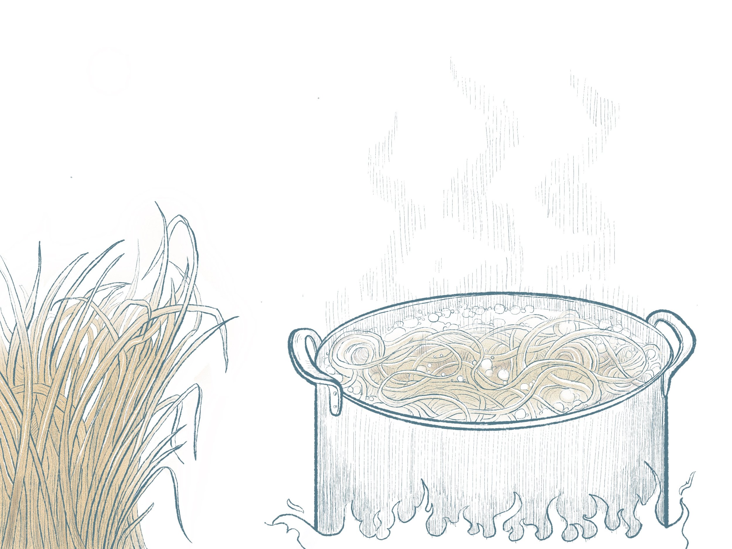
Fiber Preparation (Cooking)
Plant fibers (e.g., mulberry, hemp, cotton rags) are cut and boiled in water, often with alkaline additives, to soften and separate the cellulose.
-
![]()
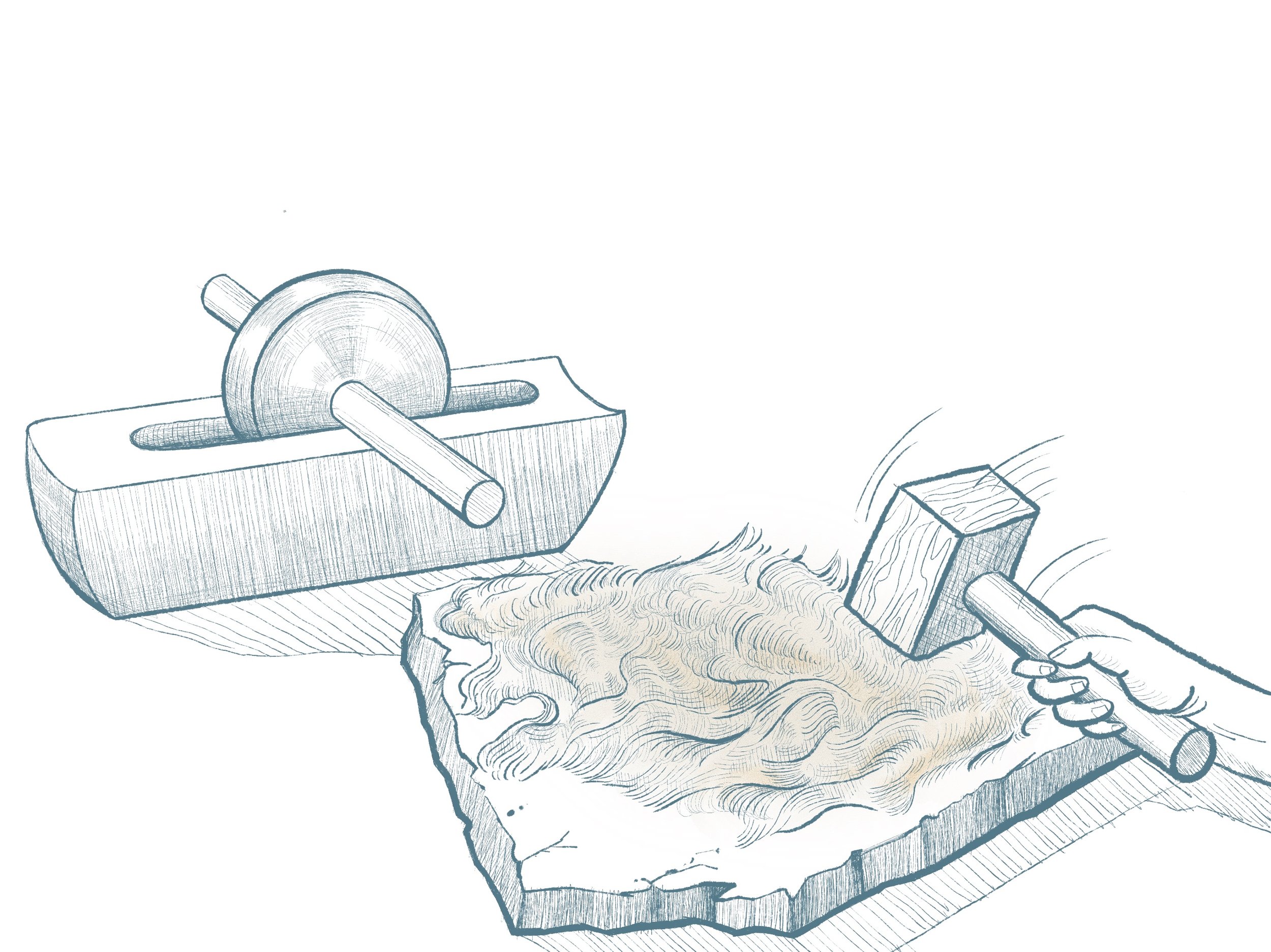
Beating the Fibers
The softened fibers are beaten by hand or machine to break them down into pulp, increasing flexibility and bonding strength.
-
![]()
Pulp Suspension
After being beaten, the pulp is mixed with water in a vat, which form a uniform fiber suspension, and ready for sheet formation.
-
![]()
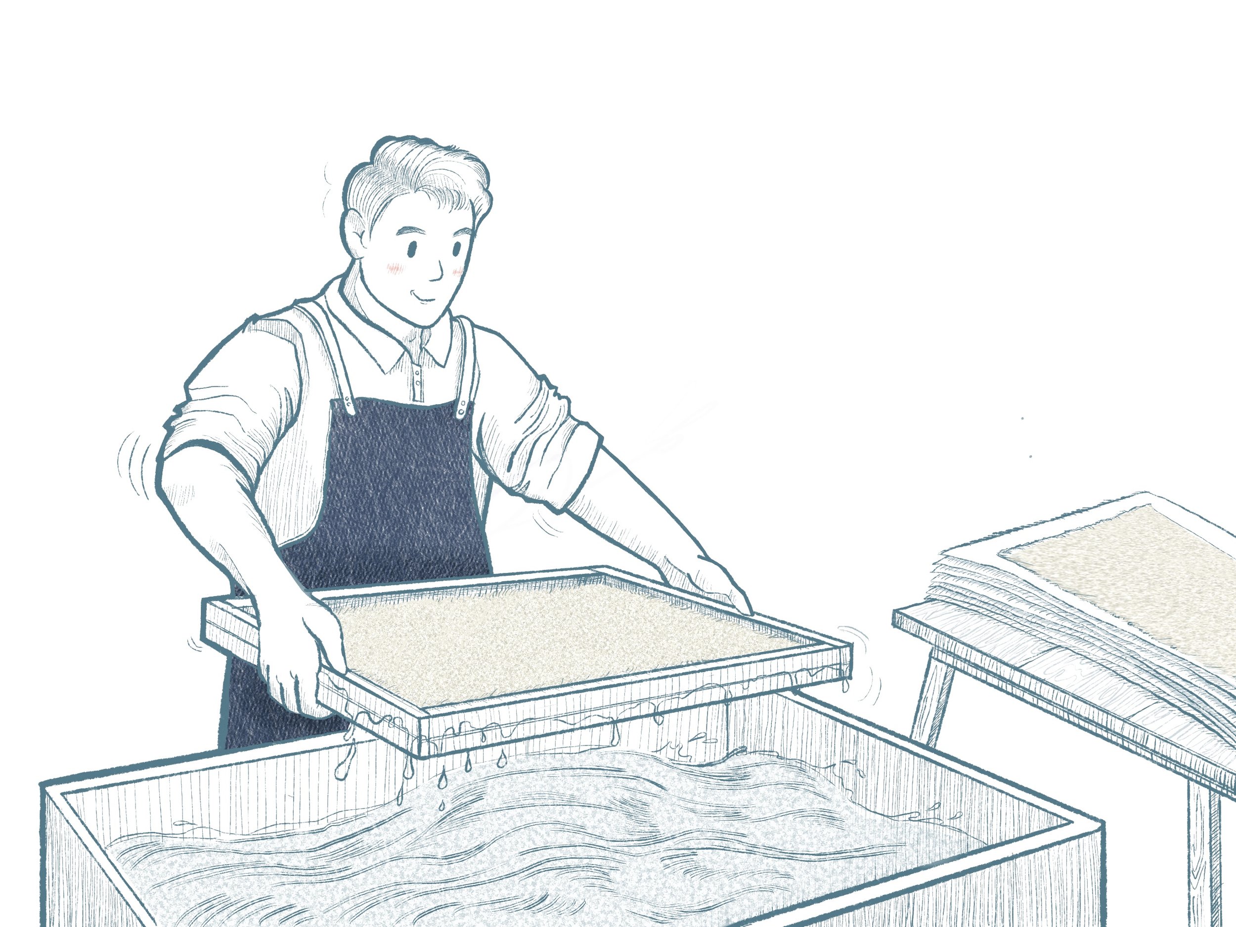
Sheet Formation
Using a mould and deckle, the papermaker dips into the vat and lifts a thin layer of pulp, allowing water to drain and fibers to interlock.
-
![]()
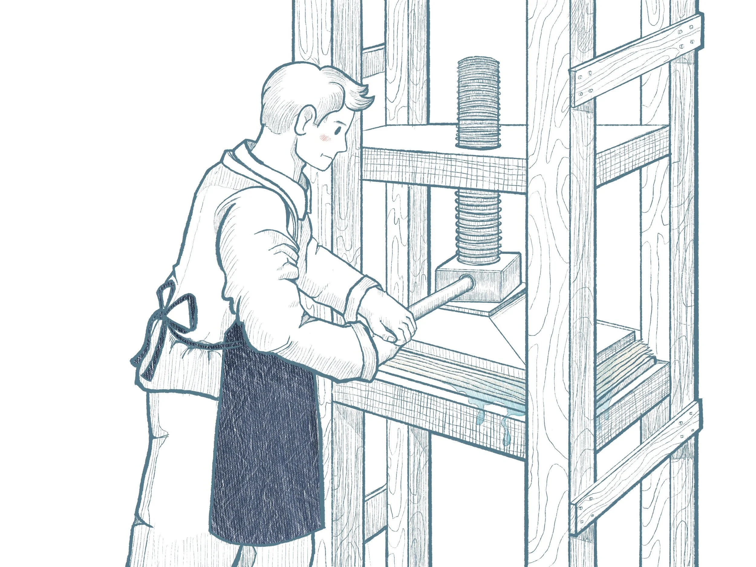
Pressing Sheets
The wet sheets are transferred (couched) onto felts and pressed to remove excess water and compact the fibers.
-
![]()
Drying Paper
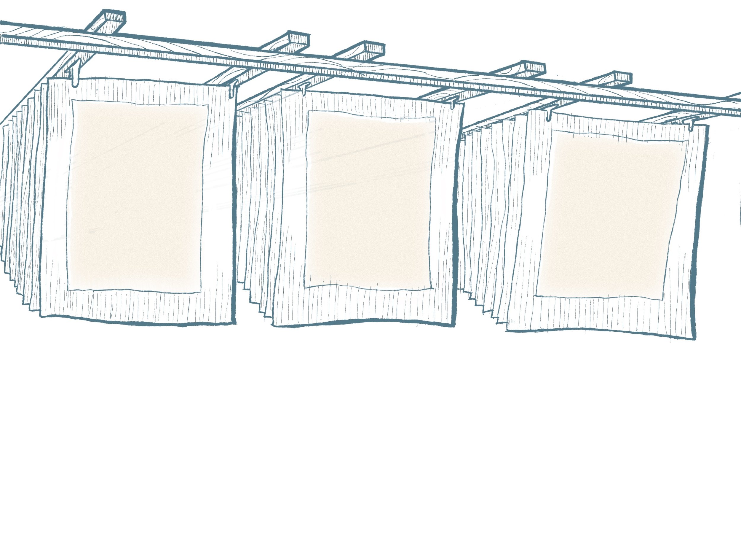
The sheets are carefully separated and hung or laid flat to dry, completing the handmade paper.

BRAND IDENTITY
*
BRAND IDENTITY *

Paper Nest draws inspiration from the image of a bird’s nest, where fragile fibers are woven together into a warm, living space.
In the same way, the brand envisions itself as a “home of handmade paper” - a place for artists, paper lovers, and those who value sustainability to share, create, and give new life to materials.
The clear space around the logo is defined as three times the stroke width of the logo, ensuring balance and clarity. The primary colour of the logo is red, symbolising warmth, energy, and creativity- key values of the brand.
Clear Spaces


Variations

In the logo variations, the figure mark is used on smaller applications with these four colors depending on the background, such as stickers, stamps, or badges. The full version is applied more broadly across extended branding materials. The monochrome version is embossed on the brand’s key products, offering a subtle and refined impression that resonates gently with customers.
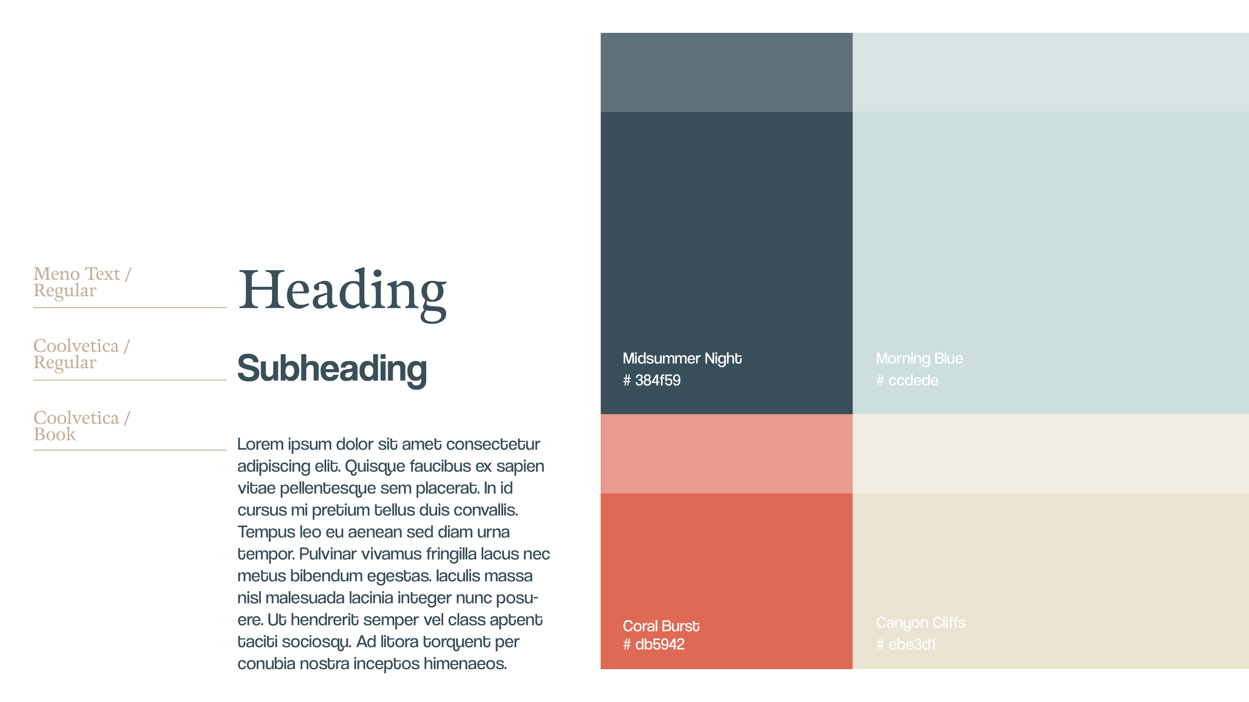
Typography & Colour
BRAND APPLICATIONS
The identity elements reflect the brand’s philosophy of craft and sustainability. Each touchpoint is designed to create a tactile experience, allowing customers to feel the texture of paper and the careful craftsmanship embedded in every detail.
Click on the image to view it in full size. ▼
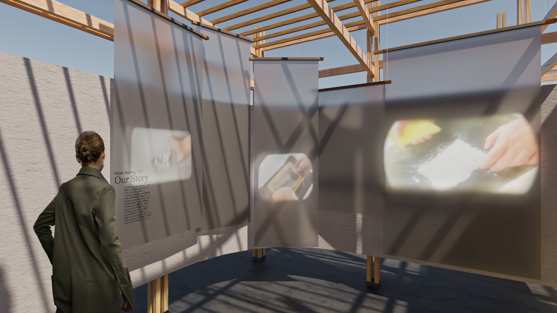
BRAND BOOK
Brand book is a specially designed publication intended to be displayed within the commercial space. It serves as an engaging element that attracts customers and invites them to interact more deeply with the brand and the traditional craft of papermaking.
Click on the image to view it in full size. ▼
BRAND BOOK PHOTOS
LAYOUT SPREAD
Click on the image to view it in full size. ▼
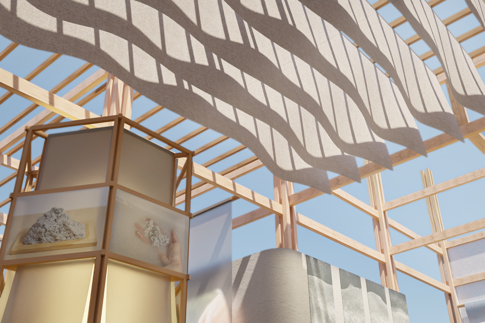
MATERIAL RESEARCHS
Click on the image to view it in full size. ▼
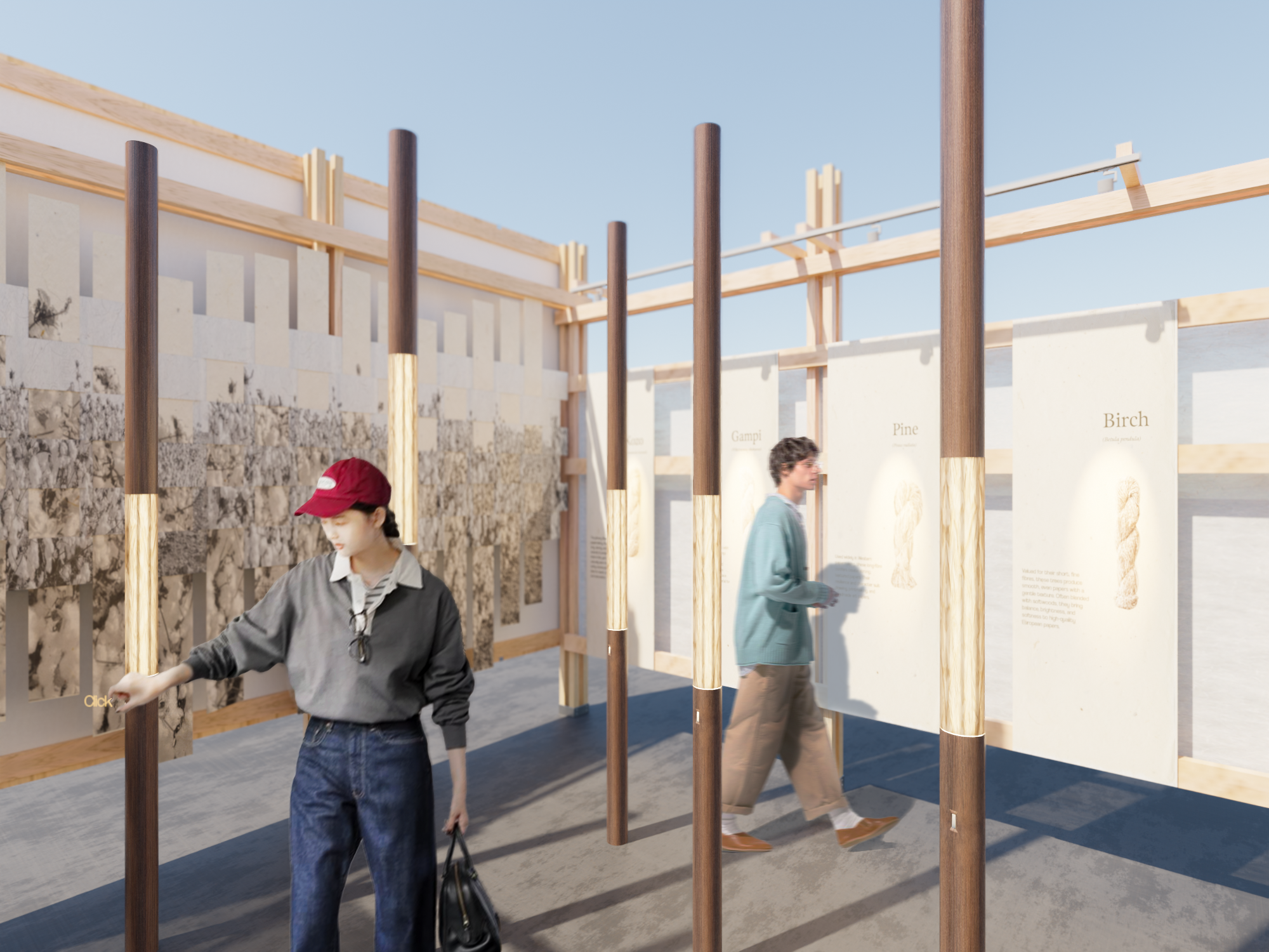
Paper, whether as a translucent sheet that captures light or as a dense, solid board, is more than a surface; It is a material of transformation. When combined with other elements such as wood, fabric, or plaster, paper extends its voice into commercial and exhibition spaces.
Material board presents the outcomes of the experiments, allowing for the envisioning of combinations and applications within an architectural space
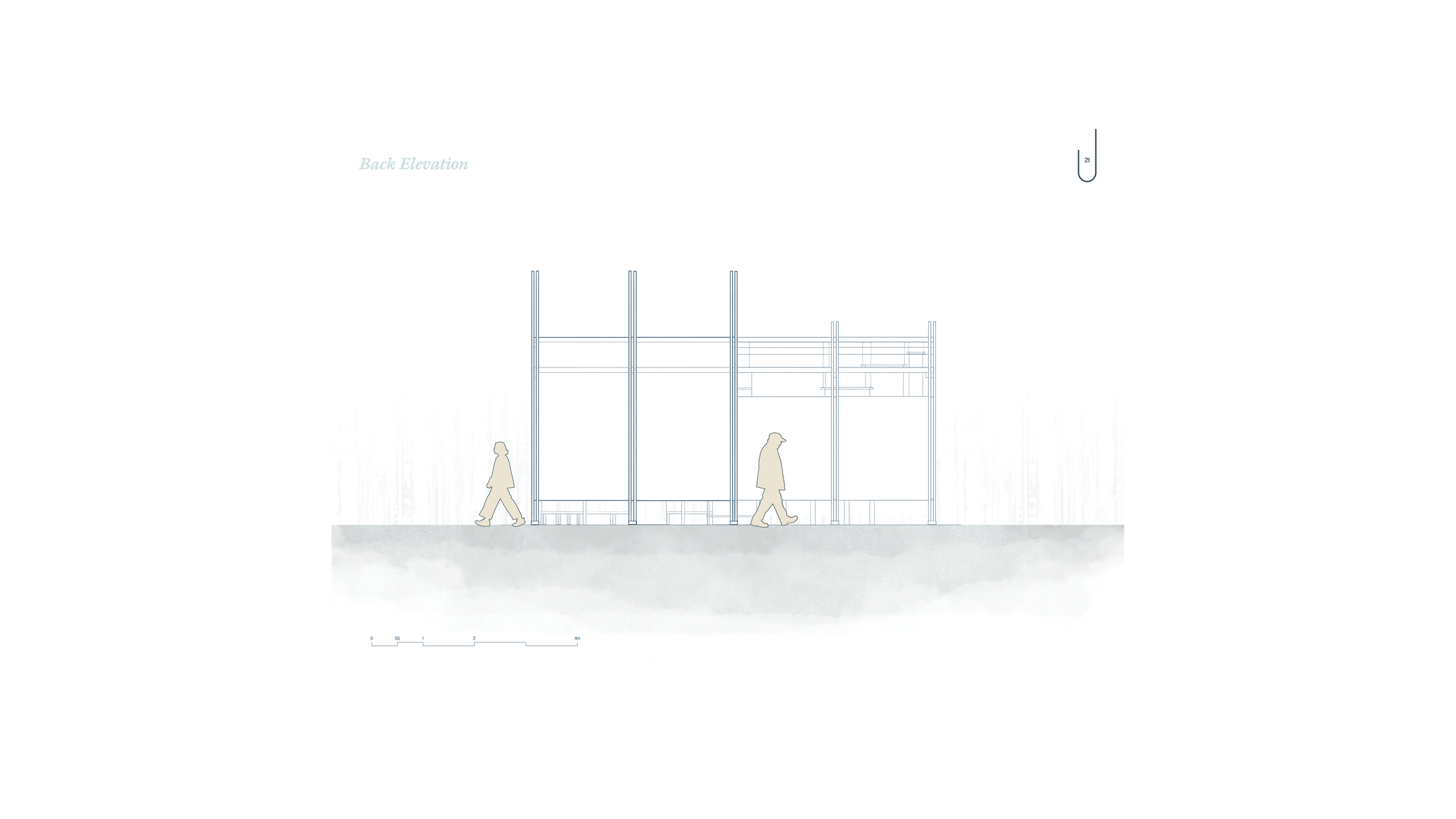
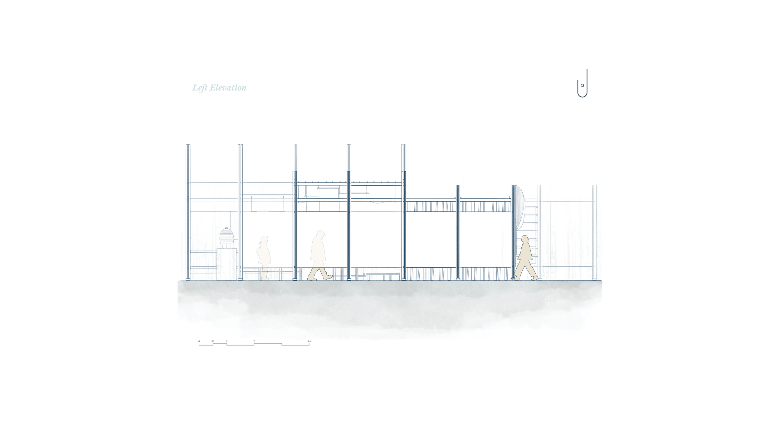
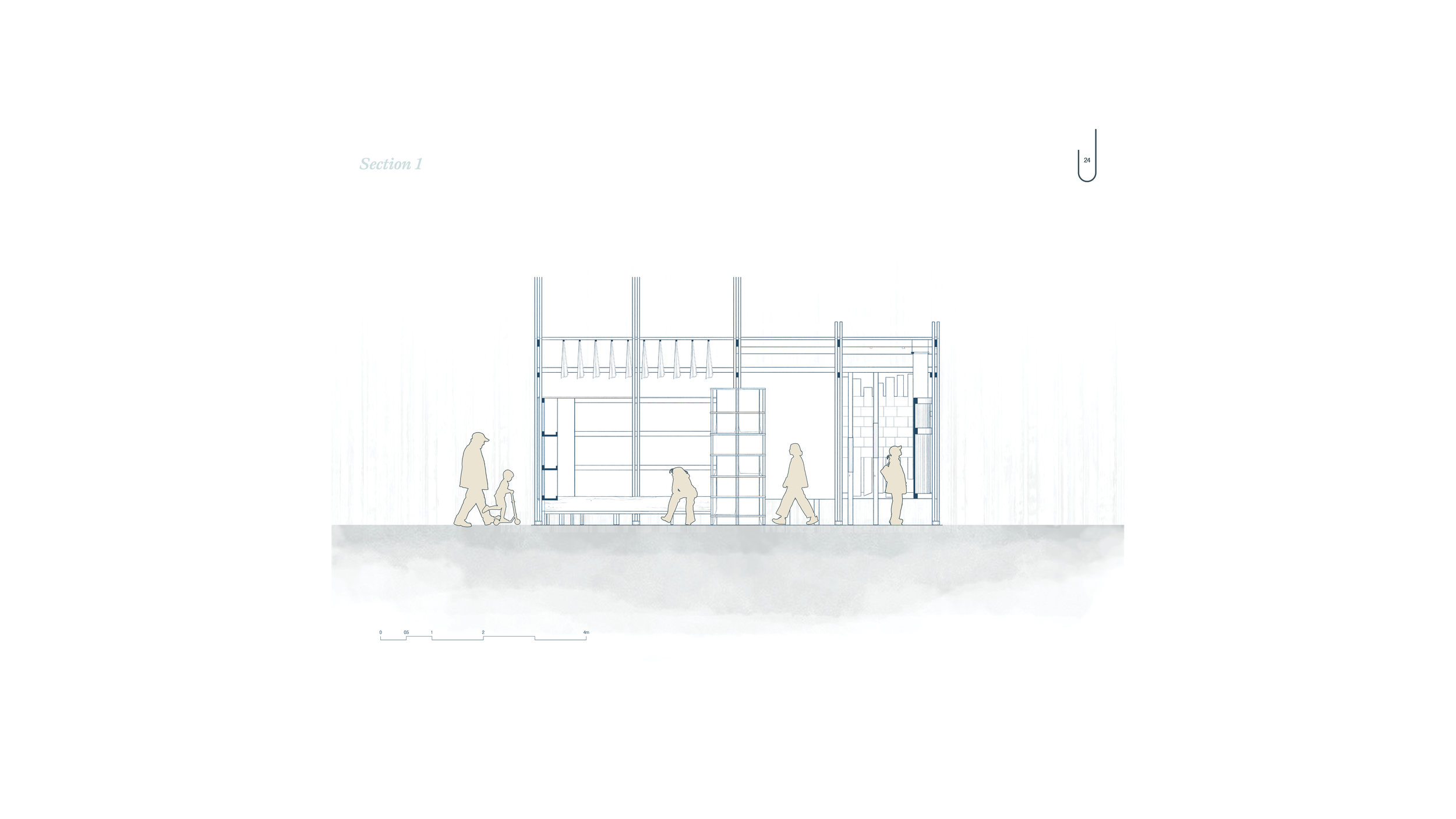
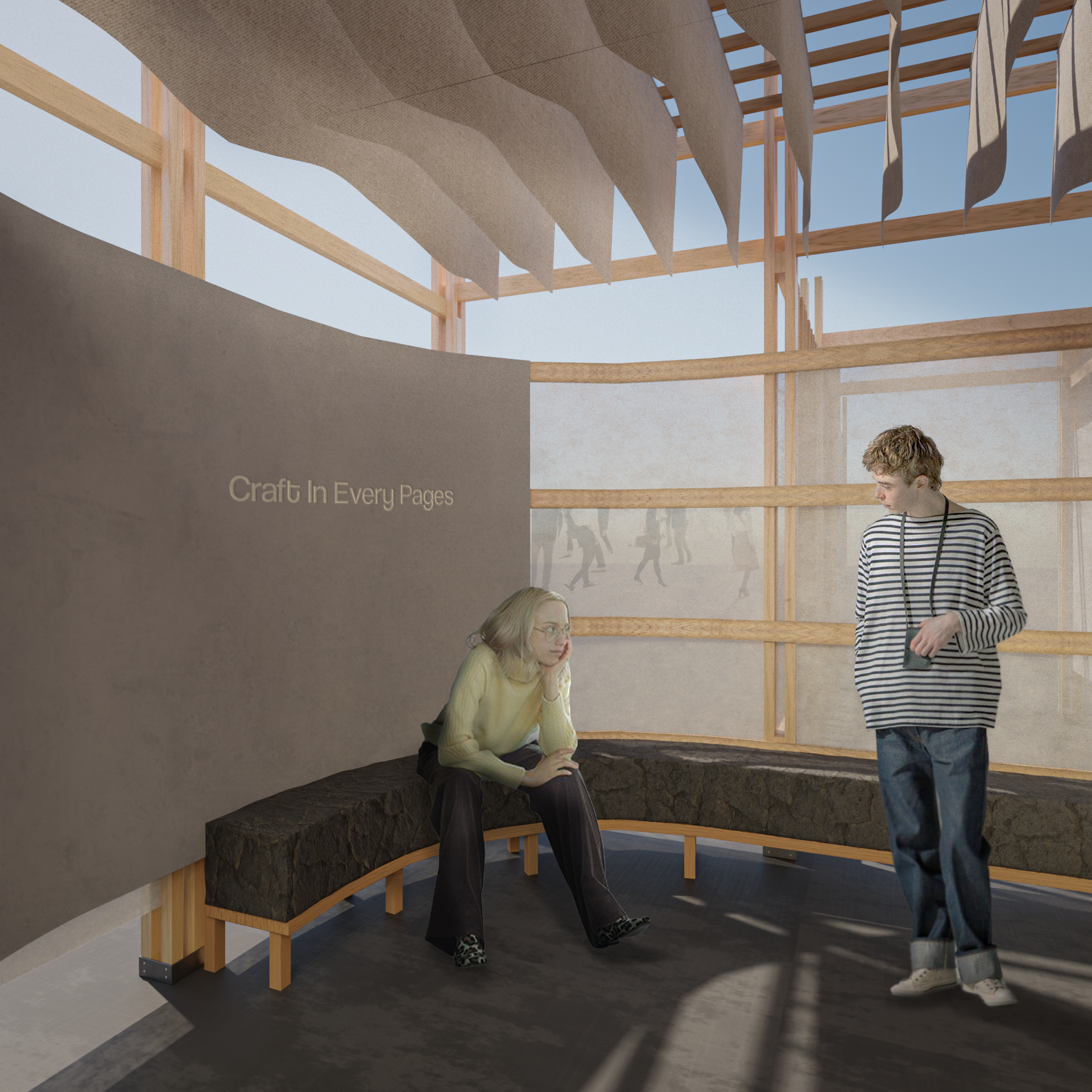
BRAND SPACE
*
BRAND SPACE *
DRAWINGS